|
|
09/15/2011 |
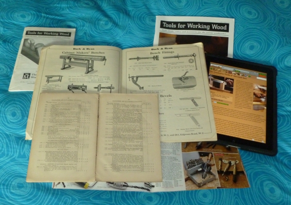
 The earliest tool catalog in my collection is a Holtzapffel Catalog (foreground) from 1863. Similar to earlier tool catalogs from the company it is basically a list of tools with prices. There is no description outside the basic contents and the catalog is really for the person who already knows what they want. Illustrated tool catalogs from the period (and earlier and in color) exist but they are rare and the exception. Mail order at this time didn't really exist and most of the surviving catalogs were really for hardware stores to order from. The earliest tool catalog in my collection is a Holtzapffel Catalog (foreground) from 1863. Similar to earlier tool catalogs from the company it is basically a list of tools with prices. There is no description outside the basic contents and the catalog is really for the person who already knows what they want. Illustrated tool catalogs from the period (and earlier and in color) exist but they are rare and the exception. Mail order at this time didn't really exist and most of the surviving catalogs were really for hardware stores to order from.
The second catalog is a 1930's tome from Buck & Ryan (center). It's typical of tool catalogs from about 1890 to the 1940's. There is very little description ( the 1896 Chas. A. Strelinger & Co. catalog with their long explanations is a rare exception) The lists of tools and sizes have been expanded to include engravings and there is some descriptive text.
Catalog remained mostly the same with a transition to black and white photographs until the 1970's when Garrett Wade came on the scene. Garrett Wade turned the tool catalog world on its ear. Gone was stogy photos and in were luscious tableaus of tools in use in a workshop. The Garrett Wade catalog peeking out from the right corner is a 2007 descendent. This type of environmental catalog is still popular and we see it all over the industry. They are big, colorful, expensive to produce, and very popular.
We have always got the overwhelming share of our sales from the internet but we felt the catalog was important because - well customers like leafing through catalogs. Our first catalog was a very small black and white affair (upper left - actually the second catalog). Over the years we have added pages and a color cover (upper right). However between changes in the way people shop - more and more of you are doing your shopping on the Internet, all over the catalog industry retailers are wondering how useful a full line catalog is. For a tiny company like ourselves the catalog was an overwhelming task and would consume myself and several other people for the entire summer. So last year we announced that our catalog was our last. It was. There is no new catalog being mailed this year. We do expect to mail something but we want to mail something to you that where the experience can't be replicated on the web.
Just because we don't have a catalog it doesn't mean we haven't been busy all summer. As you might have noticed we have a new website. While the current new release is mostly cosmetic it is designed to make the experience of learning about tools and occasionally buying tools more fun and informative. We hope with the new presentation it will be easier to browse and the experience will be more like a printed catalog - just with all the extra content we are known for. This current version has the same content as before but look for lots of new pictures and videos in the coming months. Also please look at our store on your other electronic devices. We don't use gestures on the iPad version yet but we will and while we work on mobiles now, in the next months more enhancements should make mobile surfing even easier.
Please let me know what you think both the good and the bad.
thanks!!!
joel and everyone at tfww.
PS - sorry about the small picture it should be more readable but for some reason it isn't. |
Join the conversation |
|
 Joel's Blog
 Built-It Blog
 Video Roundup
 Classes & Events
 Work Magazine


 The earliest tool catalog in my collection is a Holtzapffel Catalog (foreground) from 1863. Similar to earlier tool catalogs from the company it is basically a list of tools with prices. There is no description outside the basic contents and the catalog is really for the person who already knows what they want. Illustrated tool catalogs from the period (and earlier and in color) exist but they are rare and the exception. Mail order at this time didn't really exist and most of the surviving catalogs were really for hardware stores to order from.
Why not copy the bench catalog and put a pdf of it on your site? This would be a nice resource.
Mark
Very interesting subject. I didn't think making a catalog is such a laborious task. I think that especially looking for errors must be a nightmare. On a website one may change a bug with a few clicks of the mouse and keyboard. If another prints, lets say, 3000 copies of a catalog with a major fault...that's a more painful problem ;)
So what to send to customers, they'd like to leaf through sitting comfortably on the couch in the evening? What I would like is information about a new product with a good description, nice photos and a pre-order possibility.
Regards,
Lukasz.
I still prefer a printed catalog to flip through, but I don't like paying for them! When companies send out "free" catalogs they really aren't free at all. You need to recoup 100% of your costs through sales, and if you are paying thousands of dollars for printing and mailing - your customers are picking up that burden through higher tool prices.
If you can reduce that expense (and risk), then you will be able to offer the best possible prices.
I am disappointed in magazine publishers, however, because some of them are trying sell their electronic versions at the same subscription price as their hard copies!?
The "reasoning" is that they are spending more time (and money) developing interactive content for their iPad versions. I think they should skip that and share their savings with their readers - especially for a straight PDF-type magazine file.
Their work is already done by the time they go to print. A non-interactive version should be very inexpensive to create and distribute.
Premium content can be made available for premium prices - let the subscriber decide.
Another beef is this: Magazine publishers are charging print subscribers for the electronic version!? If I buy the magazine, why not give me the PDF? It would certainly make me a more loyal subscriber.
I understand they are selling the e-versions on disc - where you can buy 10+ years worth at a time - and there is some revenue happening there.
This will all sort itself out eventually - it's really in the premature stages now - and there is no cohesive model for eContent. It's a little like the Wild West!
Keep up the good work!
You have a good point! Even thought many people have turned to online shopping, some people still really like leafing through a catalog. I think the trick is to figure out what your particular customers prefer so you can give them what they want without wasting your money.
What would I like to see? I like the idea of a mini-catalog published once or twice a year. Something small, 16-32 pgs., highlighting new products, old favorites, and limited offers. In color or in black and white (have you considered sepia, just to be different?) I think it would remind your customers to check out your website from time to time. I don't know if you could justify the cost of production, but it would be more manageable than a comprehensive catalog.